
阅读量:69
选择的适配方案
设计稿是1920px
flexible.js 把屏幕分为 10 等份 ( flexible.js 中可修改 ,默认为 10 )
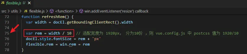 image.png
 新建 vue 项目,项目目录如下
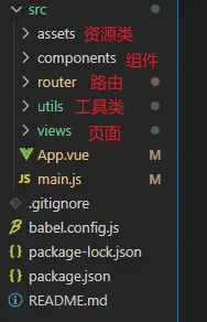 image.png
 - src / assets 文件下创建一个新的文件夹 css, css 文件夹下新建一个base.css文件用于定义全局样式
html, body, #app { padding: 0; margin: 0; height: 100%; min-width: 1024px; } body, div, span, header, footer, nav, section, aside, article, ul, ol, dl, dt, dd, li, a, p, h1, h2, h3, h4, h5, h6, i, b, textarea, button, input, select, figure, figcaption { padding: 0; margin: 0; list-style: none; font-style: normal; text-decoration: none; border: none; /*color: #333;*/ font-weight: normal; box-sizing: border-box; -webkit-tap-highlight-color: transparent; -webkit-font-smoothing: antialiased; } - src 目录下新建一个 utils 文件夹,新建 flexible.js 文件,添加以下代码
(function(win, lib) { var doc = win.document var docEl = doc.documentElement var metaEl = doc.querySelector('meta[name="viewport"]') var flexibleEl = doc.querySelector('meta[name="flexible"]') var dpr = 0 var scale = 0 var tid var flexible = lib.flexible || (lib.flexible = {}) if (metaEl) { // eslint-disable-next-line no-useless-escape var match = metaEl.getAttribute('content').match(/initial\-scale=([\d\.]+)/) if (match) { scale = parseFloat(match[1]) dpr = parseInt(1 / scale) } } else if (flexibleEl) { var content = flexibleEl.getAttribute('content') if (content) { // eslint-disable-next-line no-useless-escape var initialDpr = content.match(/initial\-dpr=([\d\.]+)/) // eslint-disable-next-line no-useless-escape var maximumDpr = content.match(/maximum\-dpr=([\d\.]+)/) if (initialDpr) { dpr = parseFloat(initialDpr[1]) scale = parseFloat((1 / dpr).toFixed(2)) } if (maximumDpr) { dpr = parseFloat(maximumDpr[1]) scale = parseFloat((1 / dpr).toFixed(2)) } } } if (!dpr && !scale) { // eslint-disable-next-line no-unused-vars var isAndroid = win.navigator.appVersion.match(/android/gi) var isIPhone = win.navigator.appVersion.match(/iphone/gi) var devicePixelRatio = win.devicePixelRatio if (isIPhone) { // iOS下,对于2和3的屏,用2倍的方案,其余的用1倍方案 if (devicePixelRatio >= 3 && (!dpr || dpr >= 3)) { dpr = 3 } else if (devicePixelRatio >= 2 && (!dpr || dpr >= 2)) { dpr = 2 } else { dpr = 1 } } else { // 其他设备下,仍旧使用1倍的方案 dpr = 1 } scale = 1 / dpr } docEl.setAttribute('data-dpr', dpr) if (!metaEl) { metaEl = doc.createElement('meta') metaEl.setAttribute('name', 'viewport') metaEl.setAttribute('content', 'initial-scale=' + scale + ', maximum-scale=' + scale + ', minimum-scale=' + scale + ', user-scalable=no') if (docEl.firstElementChild) { docEl.firstElementChild.appendChild(metaEl) } else { var wrap = doc.createElement('div') wrap.appendChild(metaEl) doc.write(wrap.innerHTML) } } function refreshRem() { var width = docEl.getBoundingClientRect().width var rem = width / 10 // 适配宽度为 1920px, 分为10份 ,则 vue.config.js 中 postcss 值为 1920/10 docEl.style.fontSize = rem + 'px' flexible.rem = win.rem = rem } win.addEventListener('resize', function() { clearTimeout(tid) tid = setTimeout(refreshRem, 300) }, false) win.addEventListener('pageshow', function(e) { if (e.persisted) { clearTimeout(tid) tid = setTimeout(refreshRem, 300) } }, false) if (doc.readyState === 'complete') { doc.body.style.fontSize = 12 * dpr + 'px' } else { doc.addEventListener('DOMContentLoaded', function() { doc.body.style.fontSize = 12 * dpr + 'px' }, false) } refreshRem() flexible.dpr = win.dpr = dpr flexible.refreshRem = refreshRem flexible.rem2px = function(d) { var val = parseFloat(d) * this.rem if (typeof d === 'string' && d.match(/rem$/)) { val += 'px' } return val } flexible.px2rem = function(d) { var val = parseFloat(d) / this.rem if (typeof d === 'string' && d.match(/px$/)) { val += 'rem' } return val } })(window, window.lib || (window.lib = {})) - 在 main.js 中引入该 flexible.js 文件 和 全局样式文件 base.css
import Vue from 'vue' import App from './App.vue' import router from './router' // 引入适配方案 import './utils/flexible' // 引入全局样式 import './assets/css/base.css' Vue.config.productionTip = false new Vue({ router, render: h => h(App) }).$mount('#app') - 安装等比适配插件,二选一即可
4-1(推荐). 安装 等比适配插件 postcss-px2rem 及 px2rem-loader
npm install postcss-px2rem px2rem-loader --save 在根目录下,新建一个 vue.config.js 文件,设置
// 引入等比适配插件 const px2rem = require('postcss-px2rem') // 配置基本大小 const postcss = px2rem({ // 基准大小 baseSize,需要和 flexible.js中相同 remUnit: 192 // 适配宽度为 1920px, 分为10份 ,值为 1920/10 }) // 使用等比适配插件 module.exports = { lintOnSave: true, css: { loaderOptions: { postcss: { plugins: [ postcss ] } } } } 4-2.(不推荐) vscode 安装 cssrem 插件 (自动将px 换算为rem)
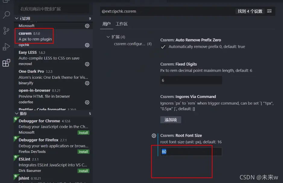 image.png