
阅读量:0
鸿蒙通用组件弹窗简介
弹窗----Toast
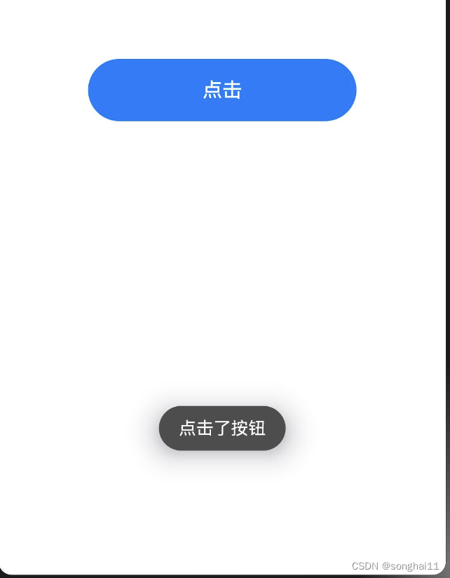
引入@ohos.promptAction模块
import promptAction from '@ohos.promptAction' 通过点击按钮,模拟弹窗
Button('点击') .width('60%') .height(50) .onClick(()=>{ promptAction.showToast({ message:'点击了按钮', // 展示的文字 duration:2000, // 停留时长 bottom: 100 // 距离底部多远 }) }) 警告对话框----AlertDialog
AlertDialog用于向用户提出告警或者确认的对话框。
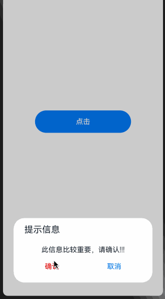
AlertDialog.show({ title:'提示信息', message:'此信息比较重要,请确认!!!', autoCancel: true, //点击遮障层时,是否关闭弹窗 alignment: DialogAlignment.Bottom, //弹窗位置 offset: { dx: 0, dy: -30 }, //相对于弹窗位置的偏移量 primaryButton: { //主要按钮 value: '确认', //按钮内容 fontColor: Color.Red, //字体颜色 action: () => { //点击回调 console.log('点击了确认按钮') } }, secondaryButton: { //次要按钮 value: '取消', action: () => { console.log('点击了取消按钮') } }, cancel: () => { //点击遮罩层取消时的回调 console.info('点击遮罩层取消时的回调') } }) 列表弹窗----ActionSheet
ActionSheet用于给用户一组列表弹窗,等用户选择后再作处理。
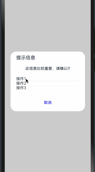
ActionSheet.show({ title:'提示信息', message: '此信息比较重要,请确认!!!', autoCancel: true, //点击遮障层时,是否关闭弹窗 alignment: DialogAlignment.Center, //弹窗位置 offset: { dx: 0, dy: -20 }, //弹窗相对alignment位置的偏移量 confirm: { //底部按钮 value: '取消', //按钮文本内容 action: () => { //按钮回调函数 console.log('点击按钮取消') } }, cancel: () => { //点击遮障层关闭弹窗时的回调 console.log('点击遮障层取消') }, sheets:[ { title:'操作1', action: () => { console.log('操作1') } }, { title:'操作2', action: () => { console.log('操作2') } }, { title:'操作3', action: () => { console.log('操作3') } }, ] }) alignment的几种位置:
DialogAlignment.Top 上部 DialogAlignment.Center 中间 DialogAlignment.Bottom 底部 DialogAlignment.TopStart 左上部 DialogAlignment.TopEnd 右上部 DialogAlignment.CenterStart 中间左边 DialogAlignment.CenterEnd 中间右边 DialogAlignment.BottomStart 左下部 DialogAlignment.BottomEnd 右下部 选择器弹窗
鸿蒙API中有很多选择器弹窗,比如时间、日期、文本等,这里就不做介绍。
自定义弹窗
在实际使用过程中,一定会遇到官方提供的弹窗不能满足需要的情况,这时候就需要尽心自定义。
这里举一个自定义弹窗的简单例子
使用@CustomDialog声明一个自定义弹窗
@CustomDialog struct CustomDialogText{ controller: CustomDialogController = new CustomDialogController({ builder: CustomDialogText() }) build(){ Column({space: 20}){ Text('内容1') Text('内容2') Text('内容3') } .margin(20) .onClick(()=>{ this.controller.close() }) } } 在build里面定义UI样式,这里只做为展示,随便定义了几个展示的文本内容
在需要使用的地方声明
在使用过程中,需要需要初始化CustomDialogController。
controller: CustomDialogController = new CustomDialogController({ builder: CustomDialogText(),// builder就是自定义的弹窗 alignment: DialogAlignment.Center, // 弹窗弹出位置 offset:{dx: 0, dy: -10} // 弹窗弹出后的偏移量,按需要进行设置 }) 定义好controller之后,在使用的时候,直接调用this.controller.open()。
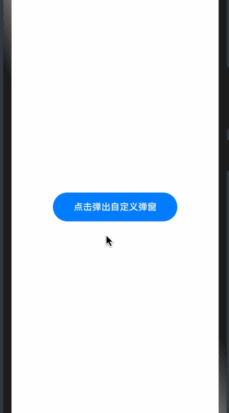
自定义弹窗,完整代码
@Entry @Component struct CommentTest{ controller: CustomDialogController = new CustomDialogController({ builder: CustomDialogText(), alignment: DialogAlignment.Center, offset:{dx: 0, dy: -10} }) build(){ Column({space: 20}){ Button('点击弹出自定义弹窗') .width('60%') .height(50) .onClick(()=>{ this.controller.open() }) } .width('100%') .height('100%') .justifyContent(FlexAlign.Center) } } @CustomDialog struct CustomDialogText{ controller: CustomDialogController = new CustomDialogController({ builder: CustomDialogText() }) build(){ Column({space: 20}){ Text('内容1') Text('内容2') Text('内容3') } .margin(20) .onClick(()=>{ this.controller.close() }) } } 