
阅读量:0
介绍
本篇Codelab使用常用组件、页面路由router实现购物应用,包含以下功能:
- 使用toolbar、toolbar-item组件实现“首页”,“新品”,“购物车”,“我的”页面切换。
- 使用list组件,展示购物车里的商品。
- 使用swiper组件,实现图片自动轮播。
- 使用panel组件,展示商品规格。
- 使用自定义组件,提高代码的可读性。
相关概念
- [swiper]:滑动容器,提供切换子组件显示的能力。
- [input]:交互式组件,包括单选框,多选框,按钮和单行文本输入框。
- [search]:搜索框组件,用于提供用户搜索内容的输入区域。
- [toolbar]:工具栏。放在界面底部,用于展示针对当前界面的操作选项。
- [toolbar-item]:工具栏[toolbar]子组件。 用于展示工具栏上的一个操作选项。
- [自定义组件]:自定义组件是用户根据业务需求,将已有的组件组合,封装成的新组件,可以在工程中多次调用,从而提高代码的可读性。
环境搭建
软件要求
- [DevEco Studio]版本:DevEco Studio 3.1 Release及以上版本。
- OpenHarmony SDK版本:API version 9及以上版本。
硬件要求
- 开发板类型:[润和RK3568开发板]。
- OpenHarmony系统:3.2 Release及以上版本。
环境搭建
完成本篇Codelab我们首先要完成开发环境的搭建,本示例以RK3568开发板为例,参照以下步骤进行:
[获取OpenHarmony系统版本]:标准系统解决方案(二进制)。以3.2 Release版本为例:
搭建烧录环境。
- [完成DevEco Device Tool的安装]
- [完成RK3568开发板的烧录]
搭建开发环境。
- 开始前请参考[工具准备],完成DevEco Studio的安装和开发环境配置。
- 开发环境配置完成后,请参考[使用工程向导]创建工程(模板选择“Empty Ability”)。
- 工程创建完成后,选择使用[真机进行调测]。
- 鸿蒙开发指导文档:
gitee.com/li-shizhen-skin/harmony-os/blob/master/README.md点击或者复制转到。
代码结构解读
本篇Codelab只对核心代码进行讲解,对于完整代码,我们会在【gitee.com/li-shizhen-skin/harmony-os/blob/master/README.md】中提供。由于本篇Codelab页面较多,因此component和pages目录下只展示“购物主页面”的hml、js、css。
`HarmonyOS与OpenHarmony鸿蒙文档籽料:mau123789是v直接拿` ├──entry/src/main/js // 代码区 │ └──MainAbility │ ├──common │ │ ├──constant │ │ │ └──commonConstants.js // 公共常量类 │ │ └──images // 图片区 │ ├──component │ │ ├──backComponent // 后退子组件 │ │ ├──commonButton // 支付按钮子组件 │ │ ├──commonToolbar // 导航栏子组件 │ │ ├──home // 购物主页子组件 │ │ ├──likedCards // 猜你喜欢卡片子组件 │ │ ├──myInfo // 我的子组件 │ │ ├──newProduct // 新品子组件 │ │ ├──orderReusableCom // 用户商品信息子组件 │ │ ├──productBuyInfo // 购买商品卡片子组件 │ │ ├──shoppingCart // 购物车子组件 │ │ └──subtitle // 副标题子组件 │ ├──i18n │ │ ├──en-US.json // 英文国际化 │ │ └──zh-CN.json // 中文国际化 │ ├──pages │ │ ├──allOrders // 全部订单页 │ │ ├──homePage // 购物主页 │ │ │ ├──homePage.css // 购物主页面样式 │ │ │ ├──homePage.hml // 购物主页面 │ │ │ └──homePage.js // 购物主页面逻辑 │ │ ├──launchPage // 启动页 │ │ ├──pendingPayment // 待支付页 │ │ ├──productDetails // 产品详情页 │ │ └──sureOrder // 确定订单页 │ └──app.js // 程序入口 └──entry/src/main/resources // 应用资源目录 构建购物应用首页
本篇Codelab选取购物应用的主页面、购物车页面、以及导航栏进行详细的讲解,对于完整代码,可在gitee源码中进行查看。
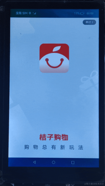
购物应用的主页面主要由界面底部导航栏和导航栏上的内容组成。效果如图所示:
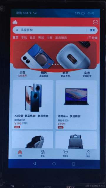
<!-- homePage.hml --> <element name="home" src="../../component/home/home.hml"></element> <element name="new-product" src="../../component/newProduct/newProduct.hml"></element> <element name="shopping-cart" src="../../component/shoppingCart/shoppingCart.hml"></element> <element name="my-info" src="../../component/myInfo/myInfo.hml"></element> <element name="common-toolbar" src="../../component/commonToolbar/commonToolbar.hml"></element> <div class="container"> <!-- 主页面 --> <home if="{{ tag === homePageIndex }}"></home> <!-- 新品页面 --> <new-product if="{{ tag === newProductIndex }}"></new-product> <!-- 购物车页面 --> <shopping-cart if="{{ tag === shoppingCartIndex }}"></shopping-cart> <!-- 我的页面 --> <my-info if="{{ tag === myInfoIndex }}"></my-info> <!-- 导航栏 --> <common-toolbar tag="{{ tag }}" @switch-toolbar="switchToolbar"></common-toolbar> </div> 底部导航栏:由“主页”、“新品”、“购物车”以及“我的”页面组成,点击导航栏内容,展示所点击模块的内容。
// homePage.js import CommonConstants from '../../common/constant/commonConstants'; export default { data: { // 页面默认展示主页,tag是主页面的索引 tag: 1, // 主页面索引 homePageIndex: CommonConstants.HOME_PAGE_INDEX, // 新品页面索引 newProductIndex: CommonConstants.NEW_PRODUCT_INDEX, // 购物车页面索引 shoppingCartIndex: CommonConstants.SHOPPING_CART_INDEX, // 我的页面索引 myInfoIndex: CommonConstants.MY_INFO_INDEX }, /** * 切换导航栏内容 * * @param value 子组件传过来的索引 */ switchToolbar(value) { this.tag = value.detail.index; } } 子组件:导航栏的使用
导航栏由“主页”、“新品”、“购物车”以及“我的”组成,点击导航栏对应的子组件,页面会展示对应模块的内容。效果如图所示:

在父组件homePage.hml中使用@switch-toolbar="switchToolbar"绑定子组件的事件,用于接收子组件传过来的索引,通过if判断,从而展示索引对应的页面。
<!-- homePage.hml --> ... <div class="container"> <!-- 主页面 --> <home if="{{ tag === homePageIndex }}"></home> <!-- 新品页面 --> <new-product if="{{ tag === newProductIndex }}"></new-product> <!-- 购物车页面 --> <shopping-cart if="{{ tag === shoppingCartIndex }}"></shopping-cart> <!-- 我的页面 --> <my-info if="{{ tag === myInfoIndex }}"></my-info> <!-- 导航栏 --> <common-toolbar tag="{{ tag }}" @switch-toolbar="switchToolbar"></common-toolbar> </div> <!-- commonToolbar.hml --> <div class="container"> <toolbar class="toolbar"> <toolbar-item value="{{ $t(toolbarName.home) }}" @click="switchToolbar(homePageIndex)" icon="{{ tag === homePageIndex ? commonIcon.home : commonIcon.homeDisable }}"> </toolbar-item> <toolbar-item value="{{ $t(toolbarName.newProduct) }}" @click="switchToolbar(newProductIndex)" icon="{{ tag === newProductIndex ? commonIcon.newProduct : commonIcon.newProductDisable }}"> </toolbar-item> <toolbar-item value="{{ $t(toolbarName.shoppingCart) }}" @click="switchToolbar(shoppingCartIndex)" icon="{{ tag === shoppingCartIndex ? commonIcon.shoppingCart : commonIcon.shoppingCartDisable }}"> </toolbar-item> <toolbar-item value="{{ $t(toolbarName.me) }}" @click="switchToolbar(myInfoIndex)" icon="{{ tag === myInfoIndex ? commonIcon.me : commonIcon.meDisable }}"> </toolbar-item> </toolbar> </div> 在子组件commonToolbar.js中通过this.$emit(‘switchToolbar’, {info: value})触发事件并向上传递参数,homePage.js中的switchToolbar方法接收子组件传过来的索引。在子组件commonToolbar.js文件中定义props,props用于组件之间的数据通信,当父组件中的tag发生变化的时候,子组件也会随之响应,然后改变toolbar-item中icon的颜色。
// homePage.js import CommonConstants from '../../common/constant/commonConstants'; export default { data: { // 页面默认展示主页,tag是主页面的索引 tag: 1, ... }, /** * 切换导航栏内容 * * @param value 子组件传过来的索引 */ switchToolbar(value) { this.tag = value.detail.index; } } // commonToolbar.js import CommonConstants from '../../common/constant/commonConstants'; export default { props: ['tag'], data: { commonIcon: CommonConstants.COMMON_TOOLBAR_ICON, toolbarName: CommonConstants.COMMON_TOOLBAR_NAME, // 主页面索引 homePageIndex: CommonConstants.HOME_PAGE_INDEX, // 新品页面索引 newProductIndex: CommonConstants.NEW_PRODUCT_INDEX, // 购物车页面索引 shoppingCartIndex: CommonConstants.SHOPPING_CART_INDEX, // 我的页面索引 myInfoIndex: CommonConstants.MY_INFO_INDEX }, /** * 向父组件传值 * * @param index 选中子模块的索引 */ switchToolbar(index) { this.$emit('switchToolbar', { index: index }); } } 构建购物车页面
购物车页面由顶部标题栏、购物车商品列表、猜你喜欢的商品列表三部分组成,并以子组件的形式显示在主页面中。其中,购物车商品列表使用list组件和for循环,实现对多条商品数据进行展示。猜你喜欢的商品列表是通过引用自定义组件实现的。效果如图所示:
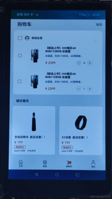
<!-- shoppingCart.hml --> <element name="liked-cards" src="../../component/likedCards/likedCards.hml"></element> <div class="container"> <div class="top"> <!-- 顶部导航标题栏 --> <div class="top-title"> <text class="shopping-cart">{{ $t('strings.shopping_cart') }}</text> <text class="edit">{{ $t('strings.edit') }}</text> </div> <!-- 购物车商品列表 --> <div class="top-list"> <div class="list-title"> <input class="all-checkbox" type="checkbox" checked="{{ isAllSelect }}" @change="checkboxOnChange"> </input> <image class="my-icon-size" src="{{ person }}"></image> <text class="mall-self-operated">{{ $t('strings.mall_self_operated') }}</text> </div> <list class="list"> <list-item for="{{ (index, item) in shoppingListData }}" class="list-item"> <div class="list-content"> <input class="checkbox" type="checkbox" checked="{{ item.isSelect }}"></input> <image class="product-pictures" src="{{ item.image }}"></image> <div class="box-content"> <text class="product-title">{{ $t(item.title) }}</text> <text class="product-subtitle">{{ $t(item.subtitle) }}</text> <div class="content-price"> <text class="product-price">{{ item.price }}</text> <div class="price-num"> <image class="my-icon-size" @click="subtractNum(index)" src="{{ item.num === 0 ? commonIcon.decreaseDisableIcon : commonIcon.decreaseIcon }}"> </image> <text class="product-num">{{ item.num }}</text> <image class="my-icon-size" src="{{ commonIcon.increaseIcon }}" @click="addNum(index)"> </image> </div> </div> </div> </div> </list-item> </list> </div> </div> <!-- 猜你喜欢商品列表 --> <div class="middle-card"> <liked-cards></liked-cards> </div> </div> - 点击“商品自营”头像前的多选框,会触发checkboxOnChange()方法,页面会勾选/不勾选购物车的中所有商品。
- 点击“+”按钮会触发addNum()方法,增加单件商品的数量。
- 点击“-”按钮会触发subtractNum()方法,减少单件商品的数量。
// shoppingCart.js import CommonConstants from '../../common/constant/commonConstants'; export default { data: { isAllSelect: false, shoppingListData: CommonConstants.SHOPPING_LIST_DATA, commonIcon: CommonConstants.SHOPPING_CART_ICON, person: CommonConstants.COMMON_ICON.person }, /** * 购物车商品全选/非全选 */ checkboxOnChange() { this.isAllSelect = !this.isAllSelect; this.shoppingListData.filter((item) => { item.isSelect = this.isAllSelect; }); }, /** * 勾选单个商品 * * @param subscript 选中商品的索引 * @param event 单选框事件 */ singleAnswer(subscript, event) { // 修改商品的选择状态 this.shoppingListData.forEach((item, index) => { if (index === subscript) { item.isSelect = event.checked; } }) // 检查购物车中的所有商品是否都被选中 let selectAll = this.shoppingListData.every(item => item.isSelect === true); if (selectAll === true) { this.isAllSelect = true; } else { this.isAllSelect = false; } }, /** * 减少商品数量逻辑 * * @param value 当前商品的数量 */ subtractNum(value) { if (this.shoppingListData[value].num > 0) { this.shoppingListData[value].num--; } }, /** * 增加商品数量逻辑 * * @param value 当前商品的数量 */ addNum(value) { this.shoppingListData[value].num++; } } 