
阅读量:0

目录
在diglog.vue中模仿element-ui搭建diglog框架
前言
🎈🎈🎈Hello,Hello。这里是Blue,本篇文章我们将在前一篇文章http://t.csdnimg.cn/6atDj的基础上,继续封装组件。该组件为经常用的diglog,让我们来尝试去封装一下吧。希望各位在学习途中可以对组件有更多的理解。🎈🎈🎈
diglog组件
准备工作:
第一步:
我们先创建一个diglog.vue组件,再在App.vue中进行对diglog的使用
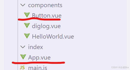
第二步:在main.js中去将diglog.vue组件声明为全局
import Diglog from './components/diglog.vue' Vue.component(Diglog.name, Diglog)在diglog.vue中模仿element-ui搭建diglog框架
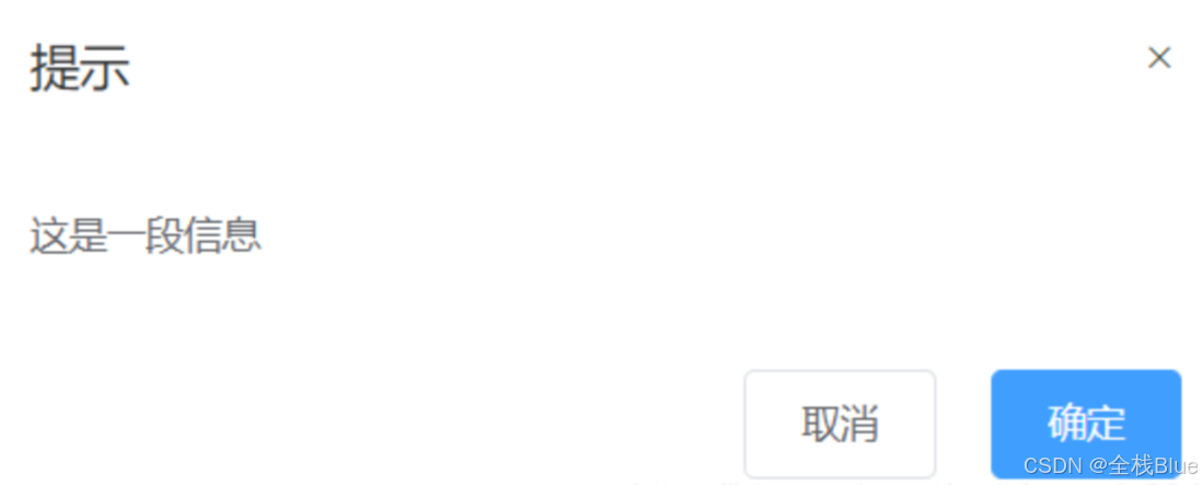
<template> <div class="one-dialog_wrapper"> <div class="one-dialog"> <div class="one-dialog_header"> <span class="one-dialog_title">提示</span> <button class="one-dialog_headerbtn"> <i class="one-icon-close"></i> </button> </div> <div class="one-dialog_body"> <span>这是一段信息</span> </div> <div class="one-dialog_footer"> <one-button>取消</one-button> <one-button type="primary">确定</one-button> </div> </div> </div> </template> <style lang="scss" scoped> .one-dialog_wrapper{ position: fixed; top: 0; right: 0; bottom: 0; left: 0; overflow: auto; margin: 0; z-index: 2001; background-color: rgba(0,0,0,0.5); .one-dialog{ position: relative; margin: 15vh auto 50px; background: #fff; border-radius: 2px; box-shadow: 0 1px 3px rgba(0,0,0,0.3); box-sizing: border-box; width: 30%; &_header{ padding: 20px 20px 10px; .one-dialog_title{ line-height: 24px; font-size: 18px; color: #303133; } .one-dialog_headerbtn{ position: absolute; top: 20px; right: 20px; padding: 0; background: transparent; border: none; outline: none; cursor: pointer; font-size: 16px; .one-icon-close{ color:909399 } } } &_body{ padding: 30px 20px; color: #606266; font-size: 14px; word-break: break-all; } &_footer{ padding: 10px 20px 20px; text-align: right; box-sizing: border-box; ::v-deep .one-button:first-child{ margin-right: 20px; } } } } </style>效果如下:
该组件需要完成的任务:
| 参数名 | 参数描述 | 参数类型 | 默认值 |
|---|---|---|---|
| title | 对话框标题 | string | 提示 |
| width | 宽度 | string | 50% |
| marginTop | 与顶部的距离 | string | 15vh |
| visible | 是否显示dialog(支持sync修饰符) | boolean | false |
| 事件名 | 事件描述 |
|---|---|
| close | 模态框关闭事件 |
title
父子组件传值以及props验证
利用{{}}将传入内容渲染上去
diglog.vue代码:
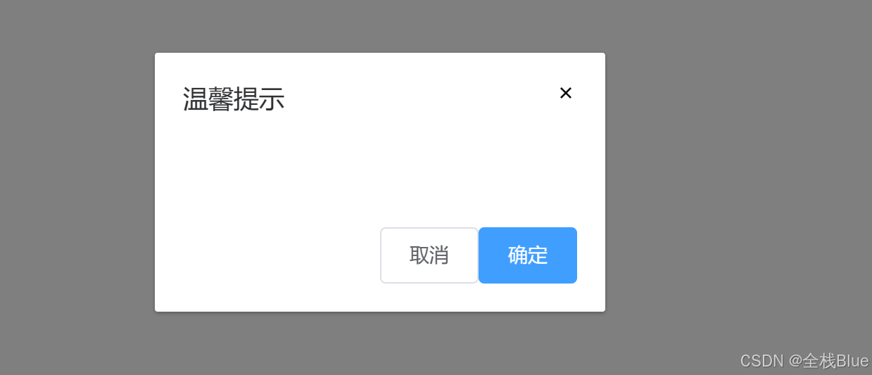
<template> <transition name="ss"> <div class="one-dialog_wrapper" v-show="visible" @click.self="close"> <div class="one-dialog" :style="{width , marginTop}" > <div class="one-dialog_header"> <span class="one-dialog_title">{{ title }}</span> <button class="one-dialog_headerbtn" @click="close"> <i class="iconfont icon-cuowu"></i> </button> </div> <div class="one-dialog_body"> <span>这是一段信息</span> </div> <div class="one-dialog_footer" > <WsButton @click="visible=false">取消</WsButton> <WsButton type="primary" @click="visible=false">确定</WsButton> </div> </div> </div> </transition> </template> export default { name: 'WsDiglog', props: { title: { type: String, default: '提示' } } </script>App.vue代码:
<WsDiglog title="温馨提示"></WsDiglog>效果:
自定义dialog的宽度和距离顶部的
App.vue代码:
<WsDiglog title="温馨提示" width="320px" marginTop="100px"></WsDiglog>diglog代码:
<template> <div class="one-dialog_wrapper"> <div class="one-dialog" :style="{width:width,marginTop:top}"> ··· </div> </div> </template> <script> export default { name: 'WsDiglog', props: { title: { type: String, default: '提示' }, width: { type: String, default: '200px' }, marginTop: { type: String, default: '30px' }, } } </script>效果:
自定义body内容
body内容可能是除span以外的其他内容,比如列表等,所以在这里使用插,并且在这里使用匿名插槽,使用匿名插槽的好处就是在使用时不需要使用template标签指定内容,直接在组件标签下编写内容即可。
diglog.vue代码:
<div class="one-dialog_body"> <slot></slot> </div>App.vue代码:
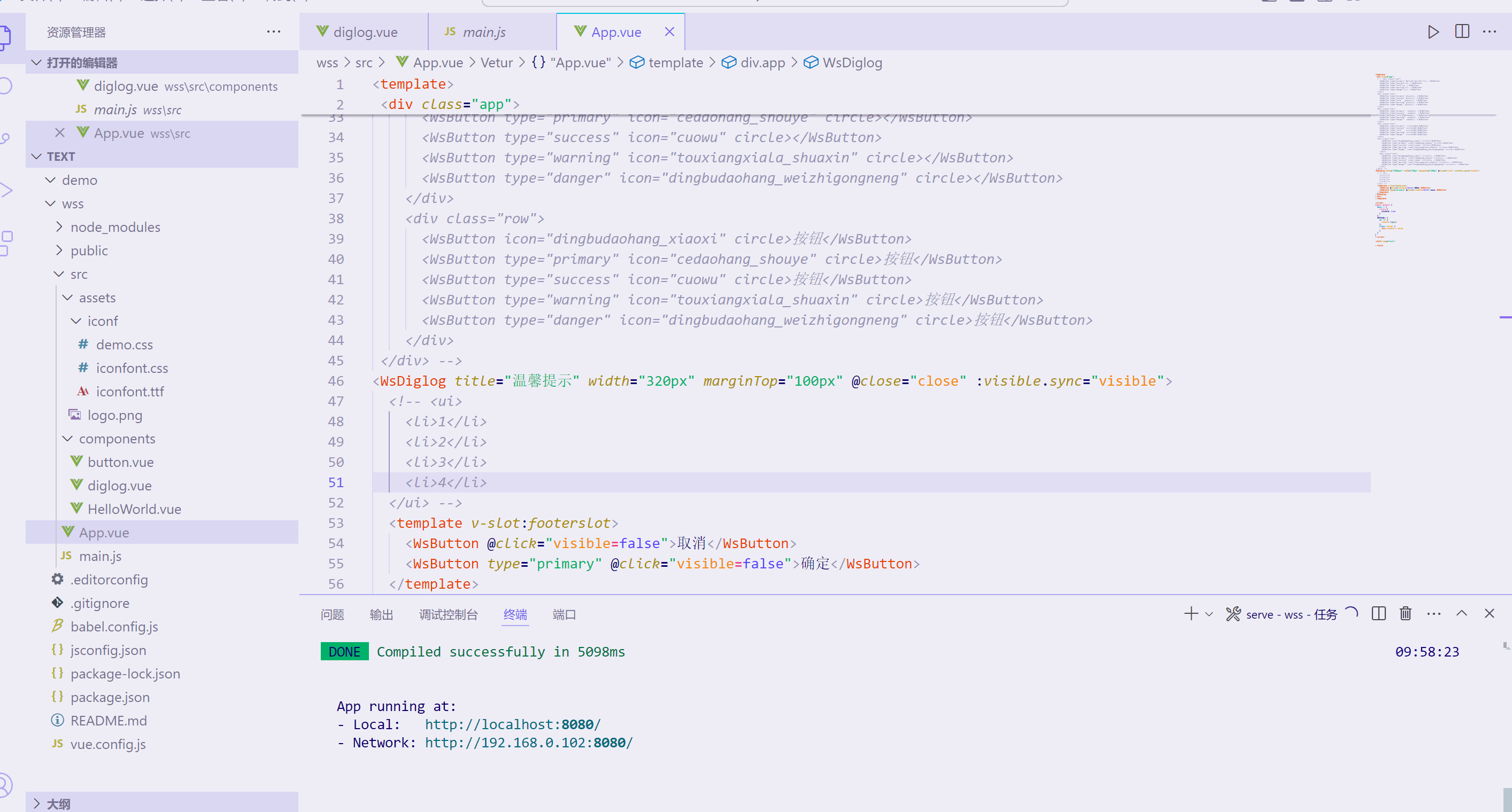
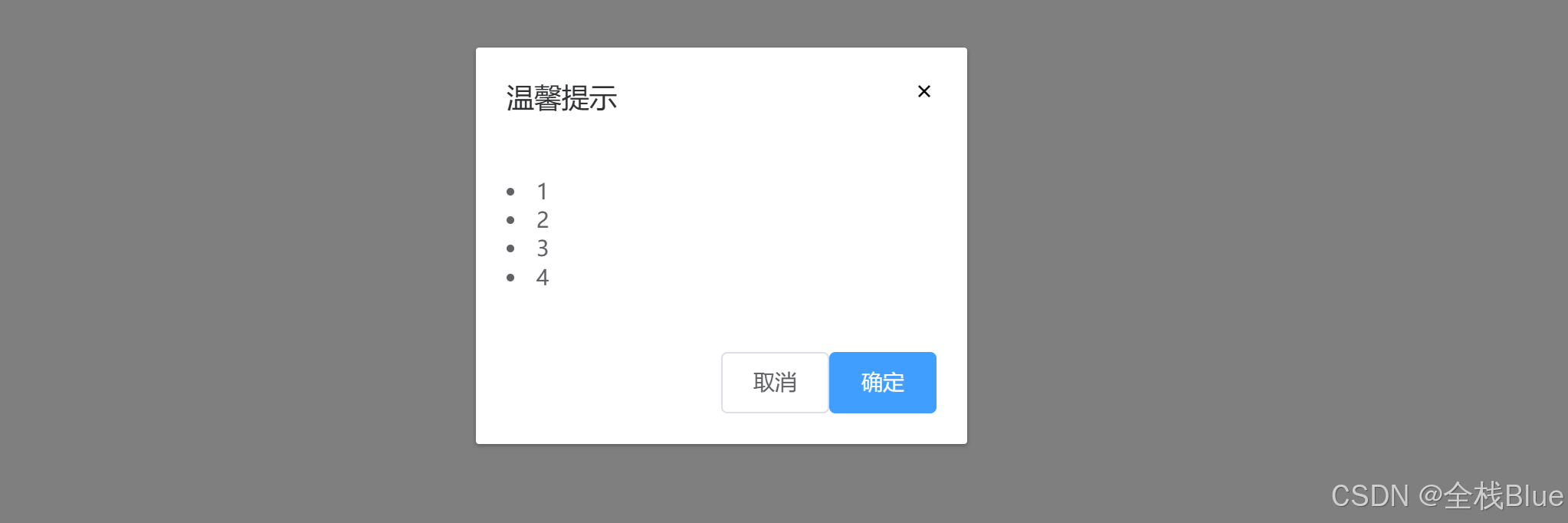
<WsDiglog title="温馨提示" width="320px" marginTop="100px" @close="close" :visible.sync="visible"> <ui> <li>1</li> <li>2</li> <li>3</li> <li>4</li> </ui> <template v-slot:footerslot> <WsButton @click="visible=false">取消</WsButton> <WsButton type="primary" @click="visible=false">确定</WsButton> </template> </WsDiglog>效果:
自定义footer内容
footer中使用slot插槽,使其能够根据用户选择来进行是否需要其他东西
diglog.vue代码:
设置footer插槽,如果没有指定footer插槽,则不显示
<div class="one-dialog_footer" v-if="$slots.footerslot"> <slot name="footerslot"></slot> </div>App.vue
<template> <div class="app"> <WsDiglog title="温馨提示" width="320px" marginTop="100px"> <ui> <li>1</li> <li>2</li> <li>3</li> <li>4</li> </ui> <template v-slot:footerslot> <WsButton>取消</WsButton> <WsButton type="primary">确定</WsButton> </template> </WsDiglog> </div> </template>效果:

dialog的显示与隐藏
dialog组件的显示与隐藏,需要使用到sync语法糖
在前端开发中,特别是在使用Vue.js框架时,.sync修饰符是一个非常重要的概念,它主要用于简化父子组件之间数据的双向绑定过程。以下是对.sync修饰符的详细解释:
.sync
定义与原理
.sync修饰符是Vue.js提供的一种语法糖,用于实现父子组件之间的双向数据绑定。在Vue 2.3.0+版本中引入,用于替代之前版本的.sync修饰符(在Vue 2.0.0中作为组件的一个特殊选项存在,但在Vue 2.3.0+中被移除并重新作为修饰符引入)。
在Vue 3中,.sync修饰符继续存在,但需要注意的是,Vue 3推荐使用v-model的多个参数形式来实现类似的功能,因为v-model在Vue 3中被重新设计以支持自定义组件的双向绑定。不过,.sync修饰符仍然可以作为一种替代方案使用。
使用场景
.sync修饰符通常用于以下场景:
当父组件需要向子组件传递一个或多个prop,并希望子组件能够修改这些prop的值时。
子组件在修改prop的值后,需要通知父组件进行更新,以保持数据的一致性。
使用方法
在父组件中,使用.sync修饰符绑定prop时,Vue会自动监听子组件触发的update:propName事件,并将接收到的新值赋给绑定的数据项。
<!-- 父组件 --> <template> <div> <child-component :some-prop.sync="parentProp"></child-component> </div> </template> <script> import ChildComponent from './ChildComponent.vue'; export default { components: { ChildComponent }, data() { return { parentProp: 'Initial Value' }; } } </script>在子组件中,当需要修改someProp的值时,通过$emit触发update:someProp事件,并传递新的值。
<!-- 子组件 --> <template> <div> <input v-model="localProp" @input="updateProp" /> </div> </template> <script> export default { props: ['someProp'], data() { return { localProp: this.someProp }; }, watch: { someProp(newVal) { this.localProp = newVal; } }, methods: { updateProp() { this.$emit('update:someProp', this.localProp); } } } </script>注意事项
.sync修饰符实际上是v-bind的语法糖,它会被扩展为v-bind绑定和v-on监听器的组合。在Vue 3中,虽然
.sync修饰符仍然可用,但推荐使用v-model的多个参数形式来实现双向绑定,因为它提供了更清晰的语义和更灵活的使用方式。使用
.sync修饰符时,需要注意避免在子组件中直接修改prop的值,因为这可能会导致数据流的不清晰和难以追踪的问题。相反,应该通过触发事件来通知父组件进行更新。
综上所述,.sync修饰符是Vue.js中用于简化父子组件之间双向数据绑定的重要工具,但在使用时需要注意其原理和限制条件。
实操
根据上面对于sync语法糖的介绍,我们在dialog显示和隐藏中要进行两种处理
第一步:
控制dialog的显示和隐藏,我们首先在子组件中使用v-show对于组建的显示与隐藏进行控制。
diglog.vue代码:
<div class="one-dialog_wrapper" v-show="visible" @click.self="handleClose"> ··· </div>第二步:
在父组件中使用:visible.sync="visible"向子组件进行传值并且接收子组件回调。
App.vue的代码:
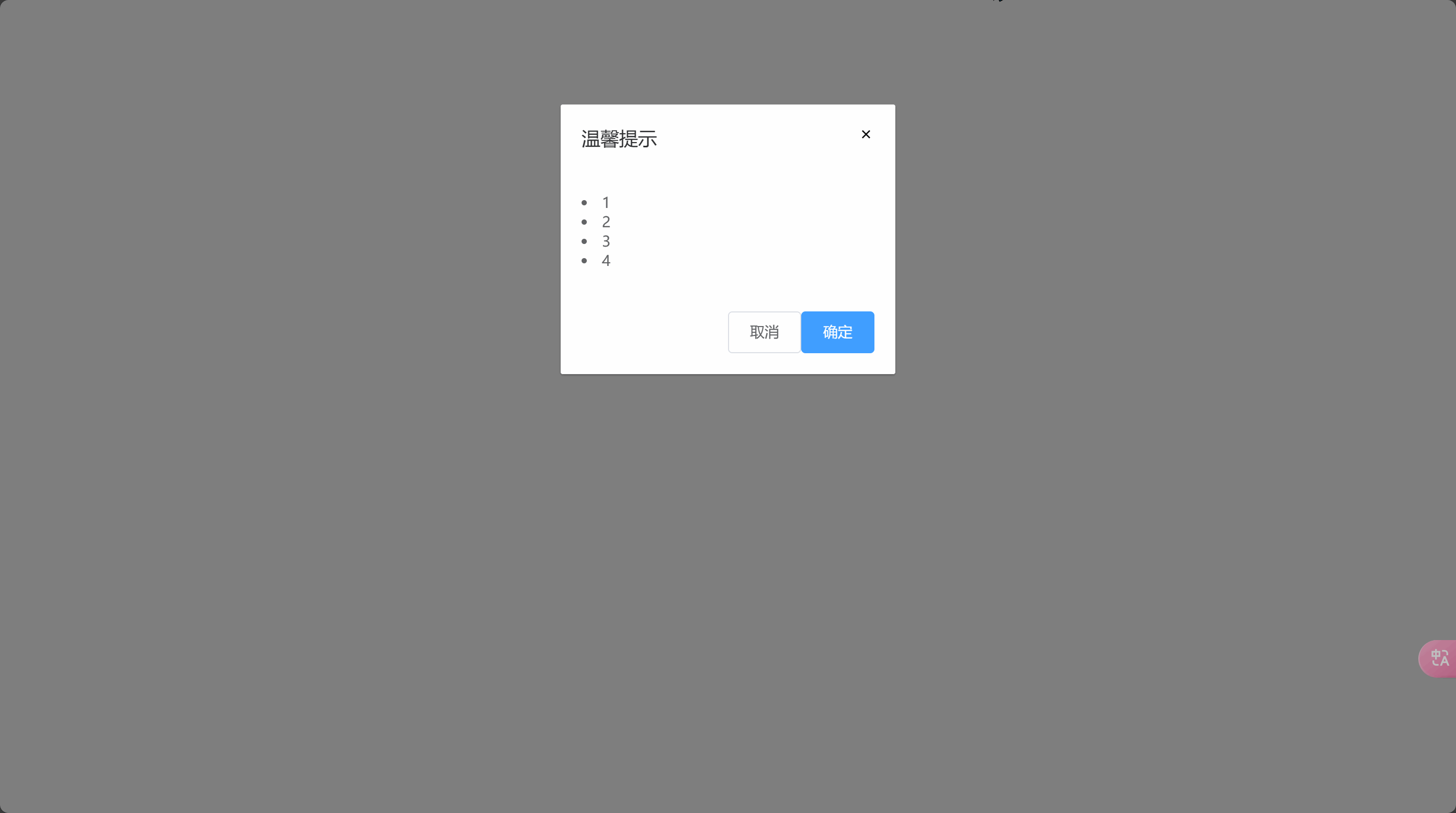
<template> <WsDiglog title="温馨提示" width="320px" marginTop="100px" @close="close" :visible.sync="visible"> <ui> <li>1</li> <li>2</li> <li>3</li> <li>4</li> </ui> <template v-slot:footerslot> <WsButton @click="visible=false">取消</WsButton> <WsButton type="primary" @click="visible=false">确定</WsButton> </template> </WsDiglog> </div> </template> <script> export default { data () { return { visible: true } }, methods: { close (value) { this.visible = value } } } </script>第三步:
diglog.vue代码:
<template> <transition name="ss"> <div class="one-dialog_wrapper" v-show="visible" @click.self="close"> <div class="one-dialog" :style="{width , marginTop}" > <div class="one-dialog_header"> <span class="one-dialog_title">{{ title }}</span> <button class="one-dialog_headerbtn" @click="close"> <i class="iconfont icon-cuowu"></i> </button> </div> <div class="one-dialog_body"> <slot></slot> </div> <div class="one-dialog_footer" v-if="$slots.footerslot"> <slot name="footerslot"></slot> </div> </div> </div> </transition> </template> <script> export default { name: 'WsDiglog', props: { title: { type: String, default: '提示' }, width: { type: String, default: '200px' }, marginTop: { type: String, default: '30px' }, visible: { type: Boolean, default: true } }, methods: { fn () { this.$emit('unpdate:visible', false) }, close () { this.$emit('close', false) } } } </script>效果
结语
🎈🎈🎈观众老爷们是否学到如何封装diglog组件了嘛?希望本篇文章对观众老爷能起帮助。🎈🎈🎈
