
阅读量:2
屏幕四周出现律动的红色边框,产生报警提示的效果。
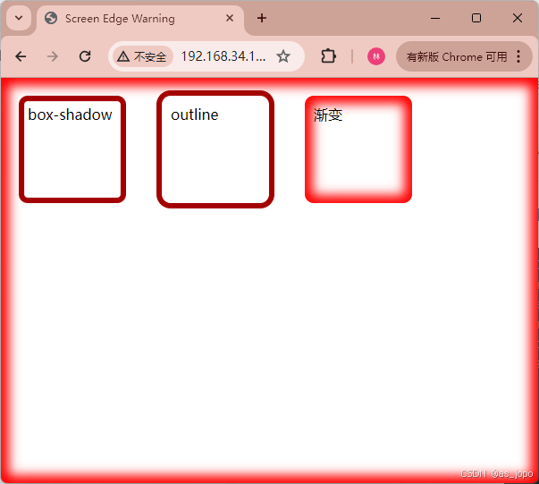
<!DOCTYPE html> <html lang="en"> <head> <meta charset="UTF-8"> <title>Screen Edge Warning</title> <style> body, html { margin: 0; padding: 0; height: 100%; } @keyframes colorChange { from { box-shadow: inset 0 0 0 10px red; /* 红色轮廓 */ } to { box-shadow: inset 0 0 0 5px darkred; /* 红色轮廓 */ } } .container div{ position: relative; border-radius: 10px; float: left; margin: 20px; padding: 10px; height: 100px; width: 100px; } /* 应用动画到元素 */ .animated-box { animation: colorChange 1s infinite alternate; /* 应用动画 */ } @keyframes colorChange2 { from { outline: 10px red solid; } to { outline: 5px darkred solid; } } .animated-box2 { animation: colorChange2 1s infinite alternate; /* 应用动画 */ } @keyframes colorChange3 { from { box-shadow: inset 0 0 20px 15px red; } to { box-shadow: inset 0 0 10px 7px red; } } .animated-box3 { animation: colorChange3 1s infinite alternate; /* 应用动画 */ } body{ animation: colorChange3 1s infinite alternate; /* 应用动画 */ } .animated-box4::before { content: ''; position: absolute; top: -10px; right: -10px; bottom: -10px; left: -10px; z-index: -1; background: radial-gradient(circle, red, #ffa73b); border-radius: inherit; box-shadow: 0 0 20px 15px rgba(0, 0, 0, 0.5); } </style> </head> <body > <div class="container"> <div class="animated-box">box-shadow</div> <div class="animated-box2">outline</div> <div class="animated-box3">渐变</div> </div> <script> </script> </body> </html> 