注:机翻,未校对。
Designing for People Who Have Better Things To Do With Their Lives
为那些生活中有更重要事情要做的人设计
When you design user interfaces, it’s a good idea to keep two principles in mind:
在设计用户界面时,最好牢记两个原则:
Users don’t have the manual, and if they did, they wouldn’t read it.
用户没有手册,如果他们有,他们就不会阅读它。In fact, users can’t read anything, and if they could, they wouldn’t want to.
事实上,用户无法阅读任何东西,如果他们可以阅读,他们也不会想要。
These are not, strictly speaking, facts, but you should act as if they are facts, for it will make your program easier and friendlier. Designing with these ideas in mind is called respecting the user, which means, not having much respect for the user. Confused? Let me explain.
严格来说,这些都不是事实,但你应该把它们当作事实来对待,因为它会让你的程序更容易、更友好。考虑到这些想法进行设计被称为尊重用户,这意味着对用户没有太多的尊重。困惑?让我解释一下。
What does it mean to make something easy to use? One way to measure this is to see what percentage of real-world users are able to complete tasks in a given amount of time. For example, suppose the goal of your program is to allow people to convert digital camera photos into a web photo album. If you sit down a group of average users with your program and ask them all to complete this task, then the more usable your program is, the higher the percentage of users that will be able to successfully create a web photo album. To be scientific about it, imagine 100 real world users. They are not necessarily familiar with computers. They have many diverse talents, but some of them distinctly do not have talents in the computer area. Some of them are being distracted while they try to use your program. The phone is ringing. WHAT? The baby is crying. WHAT? And the cat keeps jumping on the desk and batting around the mouse. I CAN’T HEAR YOU!
让一些东西易于使用意味着什么?衡量这一点的一种方法是查看现实世界用户在给定时间内能够完成任务的百分比。例如,假设程序的目标是允许人们将数码相机照片转换为网络相册。如果您让一组普通用户坐下来使用您的程序并要求他们全部完成此任务,那么您的程序的可用性越高,能够成功创建网络相册的用户百分比就越高。为了科学起见,想象一下 100 个现实世界的用户。他们不一定熟悉计算机。他们有许多不同的才能,但其中一些人显然没有计算机领域的才能。他们中的一些人在尝试使用您的程序时会分心。电话响了。什么?宝宝在哭。什么?猫不停地在桌子上跳来跳去,在老鼠周围拍打。我听不见!
Now, even without going through with this experiment, I can state with some confidence that some of the users will simply fail to complete the task, or will take an extraordinary amount of time doing it. I don’t mean to say that these users are stupid. Quite the contrary, they are probably highly intelligent, or maybe they are accomplished athletes, but vis-à-vis your program, they are just not applying all of their motor skills and brain cells to the usage of your program. You’re only getting about 30% of their attention, so you have to make do with a user who, from inside the computer, does not appear to be playing with a full deck.
现在,即使没有进行这个实验,我也可以自信地说,一些用户根本无法完成任务,或者需要花费大量时间来完成任务。我并不是说这些用户是愚蠢的。恰恰相反,他们可能是非常聪明的,或者他们可能是有成就的运动员,但相对于你的程序,他们只是没有将他们所有的运动技能和脑细胞应用到你的程序的使用中。你只能得到他们大约 30% 的注意力,所以你必须与一个用户凑合着玩,从计算机内部来看,他似乎没有玩完整的甲板。
Users Don’t Read the Manual. 用户不阅读手册。
First of all, they actually don’t have the manual. There may not be a manual. If there is one, the user might not have it, for all kinds of logical reasons: they’re on the plane; they are using a downloaded demo version from your web site; they are at home and the manual is at work; their IS department never gave them the manual. Even if they have the manual, frankly, they are simply not going to read it unless they absolutely have no other choice. With very few exceptions, users will not cuddle up with your manual and read it through before they begin to use your software. In general, your users are trying to get something done, and they see reading the manual as a waste of time, or at the very least, as a distraction that keeps them from getting their task done.
首先,他们实际上没有手册。可能没有手册。如果有的话,用户可能没有它,出于各种逻辑原因:他们在飞机上;他们使用的是从您的网站下载的演示版本;他们在家里,手册在工作;他们的 IS 部门从未给他们手册。坦率地说,即使他们有手册,除非他们绝对别无选择,否则他们根本不会阅读它。除了极少数例外,用户在开始使用您的软件之前不会紧紧抓住您的手册并通读它。一般来说,你的用户正在尝试完成一些事情,他们认为阅读手册是浪费时间,或者至少是一种干扰,使他们无法完成任务。
The very fact that you’re reading this book puts you in an elite group of highly literate people. Yes, I know, people who use computers are by and large able to read, but I guarantee you that a good percentage of them will find reading to be a chore. The language in which the manual is written may not be their first language, and they may not be totally fluent. They may be kids! They can decipher the manual if they really must, but they sure ain’t gonna read it if they don’t have to. Users do just-in-time manual reading, on a strictly need-to-know basis.
你正在阅读这本书的事实使你进入了一个由高文化程度的人组成的精英群体。是的,我知道,使用电脑的人基本上能够阅读,但我向你保证,他们中的很大一部分人会发现阅读是一件苦差事。编写手册的语言可能不是他们的第一语言,他们也可能不完全流利。他们可能是孩子!如果他们真的必须,他们可以破译手册,但如果他们没有必要,他们肯定不会阅读它。用户在严格需要知道的基础上进行即时手动阅读。
The upshot of all this is that you probably have no choice but to design your software so that it does not need a manual in the first place. The only exception I can think of is if your users do not have any domain knowledge — they don’t really understand what the program is intended to do, but they know that they better learn. A great example of this is Intuit’s immensely popular small-business accounting program QuickBooks. Many of the people who use this program are small business owners who simply have no idea what’s involved in accounting. The manual for QuickBooks assumes this and assumes that it will have to teach people basic accounting principles. There’s no other way to do it. Still, if you do know accounting, QuickBooks is easy to use without the manual.
所有这一切的结果是,您可能别无选择,只能设计您的软件,以便它首先不需要手册。我能想到的唯一例外是,如果你的用户没有任何领域知识 —— 他们并不真正理解程序的目的是什么,但他们知道他们最好学习。一个很好的例子是 Intuit 非常受欢迎的小型企业会计程序 QuickBooks。许多使用此程序的人都是小企业主,他们根本不知道会计涉及什么。QuickBooks 的手册假设了这一点,并假设它必须教人们基本的会计原则。没有其他方法可以做到这一点。不过,如果您确实了解会计,QuickBooks 无需手册即可轻松使用。
In fact, users don’t read *anything*.
事实上,用户什么都不读。
This may sound a little harsh, but you’ll see, when you do usability tests, that there are quite a few users who simply do not read words that you put on the screen. If you pop up an error box of any sort, they simply will not read it. This may be disconcerting to you as a programmer, because you imagine yourself as conducting a dialog with the user. Hey, user! You can’t open that file, we don’t support that file format! Still, experience shows that the more words you put on that dialog box, the fewer people will actually read it.
这听起来可能有点刺耳,但你会发现,当你进行可用性测试时,有相当多的用户根本不会阅读你放在屏幕上的单词。如果您弹出任何类型的错误框,他们根本不会阅读它。作为程序员,这可能会让您感到不安,因为您想象自己正在与用户进行对话。嘿,用户!您无法打开该文件,我们不支持该文件格式!尽管如此,经验表明,您在该对话框中输入的单词越多,实际阅读它的人就越少。
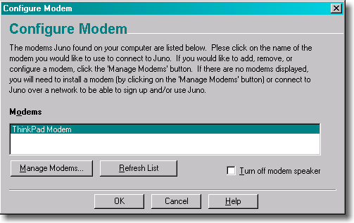
The fact that users do not read the manual leads many software designers to assume that they are going to have to educate users by describing things as they go along. You see this all over the place in programs. In principle, it’s OK, but in reality, people’s aversion to reading means that this will almost always get you in trouble. Experienced UI designers literally try to minimize the number of words on dialogs to increase the chances that they will get read. When I worked on Juno, the UI people understood this principle and tried to write short, clear, simple text. Sadly, the CEO of the company had been an English major at an Ivy League college; he had no training in UI design or software engineering, but he sure thought he was a good editor of prose. So he vetoed the wording done by the professional UI designers and added lots of his own verbiage. A typical dialog in Juno looks like this:
用户不阅读手册的事实导致许多软件设计人员认为他们将不得不通过描述用户来教育用户。你在程序中到处都能看到这一点。原则上,这没关系,但实际上,人们对阅读的厌恶意味着这几乎总是会给你带来麻烦。有经验的 UI 设计师会尽量减少对话框中的单词数量,以增加它们被阅读的机会。当我在 Juno 上工作时,UI 人员理解了这个原则,并试图写出简短、清晰、简单的文本。可悲的是,该公司的首席执行官曾是常春藤盟校的英语专业学生;他没有接受过 UI 设计或软件工程方面的培训,但他确实认为自己是一名优秀的散文编辑。因此,他否决了专业 UI 设计师的措辞,并添加了很多自己的措辞。Juno 中的典型对话框如下所示:

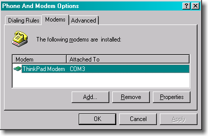
Compare that to the equivalent dialog from Windows:
将其与 Windows 中的等效对话框进行比较:

Intuitively, you might guess that the Juno version, with 80 words of instructions, would be “superior” (i.e., easier to use) than the Windows version, with 5 words of instructions. In reality, when you run a usability test on this kind of thing, you’ll find that
凭直觉,您可能会猜到具有 80 个单词说明的 Juno 版本会比具有 5 个单词说明的 Windows 版本 “更好”(即更易于使用)。实际上,当你对这种东西进行可用性测试时,你会发现
- advanced users skip over the instructions. They assume they know how to use things and don’t have time to read complicated instructions
高级用户跳过说明。他们假设他们知道如何使用东西,没有时间阅读复杂的说明 - most novice users skip over the instructions. They don’t like reading too much and hope that the defaults will be OK
大多数新手用户会跳过说明。他们不喜欢阅读太多,并希望默认值没问题 - the remaining novice users who do, earnestly, try to read the instructions (some of whom are only reading them because it’s a usability test and they feel obliged) are often confused by the sheer number of words and concepts. So even if they were pretty confident that they would be able to use the dialog when it first came up, the instructions actually confused them even more.
剩下的新手用户认真地尝试阅读说明(其中一些人只是因为这是一个可用性测试而阅读它们,他们觉得有义务)经常被大量的单词和概念所迷惑。因此,即使他们非常有信心能够在第一次出现对话框时使用该对话框,但这些说明实际上使他们更加困惑。
Now, Juno was obviously micro-managed beyond all reason. More to the point, if you’re an English major from Columbia, then you are in a whole different league of literacy than the average Joe, and you should be very careful about wording dialogs that look helpful to you. Shorten it, dumb it down, simplify, get rid of the complicated clauses in parentheses, and usability test. But do not write things that look like Ivy League faculty memos. Even adding the word “please” to a dialog, which may seem helpful and polite, is going to slow people down: the increased bulk of the wording is going to reduce, by some measurable percentage, the number of people who read the text.
现在,朱诺显然是超乎寻常的微观管理。更重要的是,如果你是哥伦比亚大学的英语专业学生,那么你的解读能力与普通人完全不同,你应该非常小心那些看起来对你有帮助的措辞对话框。缩短它,简化它,去掉括号里复杂的从句,以及可用性测试。但不要写看起来像常春藤盟校教师备忘录的东西。甚至在对话中添加 “请” 一词,这似乎很有帮助和礼貌,也会减慢人们的速度:增加的措辞量将减少阅读文本的人数,以某种可衡量的百分比。
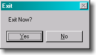
Another important point is that many people are intimidated by computers. You probably know this, right? But you may not realize the implications of this. I was watching a friend try to exit Juno. For some reason she was having quite a bit of trouble. I noticed that when you try to exit Juno, the following dialog pops up:
另一个重要的一点是,许多人被计算机吓倒了。你可能知道这一点,对吧?但你可能没有意识到这其中的含义。我看到一个朋友试图离开朱诺。出于某种原因,她遇到了相当多的麻烦。我注意到,当您尝试退出 Juno 时,会弹出以下对话框:

She was hitting No, and then she was kind of surprised that Juno hadn’t exited. The very fact that Juno was questioning her choice made her immediately assume that she was doing something wrong. Usually, when programs ask you to confirm a command, it’s because you’re about to do something which you might regret. She had assumed that if the computer was questioning her judgment, then the computer must have been right, because, after all, computers are computers where as she was merely a human, so she hit “No.”
她打了 “不”,然后她有点惊讶朱诺没有退出。朱诺质疑她的选择这一事实让她立即认为自己做错了什么。通常,当程序要求您确认命令时,这是因为您将要做一些您可能会后悔的事情。她认为,如果计算机质疑她的判断,那么计算机一定是对的,因为毕竟计算机是计算机,因为她只是一个人,所以她打了 “不”。
Is it too much to ask people to read 11 lousy words? Well, apparently. First of all, since exiting Juno has no deleterious effects, Juno should have just exited without prompting for confirmation, like every other GUI program in existence. But even if you are convinced that it is crucial that people confirm before exiting, you could do it in two words instead of 11:
要求人们读 11 个糟糕的单词是不是太过分了?嗯,显然。首先,由于退出 Juno 没有有害影响,因此 Juno 应该像现有的其他 GUI 程序一样,在没有提示确认的情况下退出。但是,即使你确信人们在退出前确认是至关重要的,你也可以用两个词而不是 11 个词来做到这一点:

Without the completely unnecessary “thank you” and the remorse-inspiring “are you sure?“, this dialog is a lot less likely to cause problems. Users will certainly read the two words, say “um, duh?” to the program, and pound the Yes key.
如果没有完全不必要的 “谢谢” 和令人懊悔的 “你确定吗?”,这个对话不太可能引起问题。用户肯定会读到这两个词,对程序说 “嗯,呃?”,然后敲击 “是” 键。
Sure, the Juno Exit Confirmation dialog trips up a few people, you say, but is it that big a deal? Everyone will eventually manage to get out of the program. But herein lies the difference between a program which is possible to use versus a program which is easy to use. Even smart, experienced, advanced users will appreciate things that you do to make it easy for the distracted, inexperienced, beginner users. Hotel bathtubs have big grab bars. They’re just there to help disabled people, but everybody uses them anyway to get out of the bathtub. They make life easier even for the physically fit.
当然,Juno 退出确认对话框绊倒了一些人,但这有那么大不了吗?每个人最终都会设法退出该计划。但这就是可以使用的程序与易于使用的程序之间的区别。即使是聪明、有经验的高级用户也会欣赏您为分心、没有经验的初学者用户所做的工作。酒店浴缸设有大扶手。它们只是为了帮助残疾人,但无论如何,每个人都会用它们来摆脱浴缸。即使对于身体健康的人来说,它们也让生活更轻松。
via:
Designing for People Who Have Better Things To Do With Their Lives – Joel on Software
