
阅读量:1
智慧金融-数据可视化
导入所需的库
import numpy as np import numpy_financial as npf import matplotlib.pyplot as plt from pylab import mpl mpl.rcParams['font.sans-serif']=['FangSong'] mpl.rcParams['axes.unicode_minus']=False 单图曲线图
r = 0.05 # 贷款的年利率 n = 30 # 贷款的期限(年) principle = 8e6 # 贷款的本金 pay_month=npf.pmt(rate=r/12, nper=n*12, pv=principle, fv=0, when='end') # 计算每月支付的本息之和 print('每月偿还的金额',round(pay_month,2)) 每月偿还的金额 -42945.73
T_list=np.arange(n*12)+1 # 生成一个包含每次还款期限的数组 prin_month=npf.ppmt(rate=r/12,per=T_list,nper=n*12,pv=principle,fv=0,when='end') # 计算每月偿还的本金金额 inte_month=npf.ipmt(rate=r/12,per=T_list,nper=n*12,pv=principle,fv=0,when='end') # 计算每月偿还的本金金额 pay_month_list=pay_month*np.ones_like(prin_month) # 创建每月偿还金额的数组 plt.figure(figsize=(9,6),frameon=False) plt.plot(T_list,-pay_month_list,'r-',label=u'每月偿还金额',lw=2.5) plt.plot(T_list,-prin_month,'m--',label=u'每月偿还本金金额',lw=2.5) plt.plot(T_list,-inte_month,'b--',label=u'每月偿还利息金额',lw=2.5) plt.xlabel(u'逐次偿还的期限(月)', fontsize=14) plt.yticks(fontsize=13) plt.ylabel(u'金额',fontsize=13) plt.title(u'等额本息还款规则下每月偿还的金额以及本金利息', fontsize=14) plt.legend(loc=0, fontsize=13) plt.grid() plt.show() 
多图曲线图
import pandas as pd import matplotlib.pyplot as plt SZ_Index = pd.read_excel('data/深证成指每日价格数据(2018-2020年).xlsx',sheet_name='Sheet1',header=0,index_col=0) SZ_Index.index # 显示行索引的格式 Index([‘2018-01-02’, ‘2018-01-03’, ‘2018-01-04’, ‘2018-01-05’, ‘2018-01-08’,
‘2018-01-09’, ‘2018-01-10’, ‘2018-01-11’, ‘2018-01-12’, ‘2018-01-15’,
…
‘2020-12-18’, ‘2020-12-21’, ‘2020-12-22’, ‘2020-12-23’, ‘2020-12-24’,
‘2020-12-25’, ‘2020-12-28’, ‘2020-12-29’, ‘2020-12-30’, ‘2020-12-31’],
dtype=‘object’, name=‘日期’, length=730)
SZ_Index.index=pd.DatetimeIndex(SZ_Index.index) # 将数据框的行索引转换为 Datatime 格式 SZ_Index.index # 显示更新后的行索引的格式,由原来的 object 格式转换为了 datatime 格式 DatetimeIndex([‘2018-01-02’, ‘2018-01-03’, ‘2018-01-04’, ‘2018-01-05’,
‘2018-01-08’, ‘2018-01-09’, ‘2018-01-10’, ‘2018-01-11’,
‘2018-01-12’, ‘2018-01-15’,
…
‘2020-12-18’, ‘2020-12-21’, ‘2020-12-22’, ‘2020-12-23’,
‘2020-12-24’, ‘2020-12-25’, ‘2020-12-28’, ‘2020-12-29’,
‘2020-12-30’, ‘2020-12-31’],
dtype=‘datetime64[ns]’, name=‘日期’, length=730, freq=None)
plt.figure(figsize=(11,9)) plt.subplot(2,2,1) plt.plot(SZ_Index['开盘价'],'r-',label=u'深证成指开盘价',lw=2.0) plt.xticks(fontsize=13,rotation=30) plt.xlabel(u'日期',fontsize=13) plt.yticks(fontsize=13) plt.ylabel(u'价格',fontsize=13) plt.legend(loc=0,fontsize=13) plt.grid() plt.subplot(2,2,2) plt.plot(SZ_Index['最高价'],'b-',label=u'深证成指最高价',lw=2.0) plt.xticks(fontsize=13,rotation=30) plt.xlabel(u'日期',fontsize=13) plt.yticks(fontsize=13) plt.ylabel(u'价格',fontsize=13) plt.legend(loc=0,fontsize=13) plt.grid() plt.subplot(2,2,3) plt.plot(SZ_Index['最低价'],'c-',label=u'深证成指最低价',lw=2.0) plt.xticks(fontsize=13,rotation=30) plt.xlabel(u'日期',fontsize=13) plt.yticks(fontsize=13) plt.ylabel(u'价格',fontsize=13) plt.legend(loc=0,fontsize=13) plt.grid() plt.subplot(2,2,4) plt.plot(SZ_Index['收盘价'],'k-',label=u'深证成指收盘价',lw=2.0) plt.xticks(fontsize=13,rotation=30) plt.xlabel(u'日期',fontsize=13) plt.yticks(fontsize=13) plt.ylabel(u'价格',fontsize=13) plt.legend(loc=0,fontsize=13) plt.grid() plt.show() 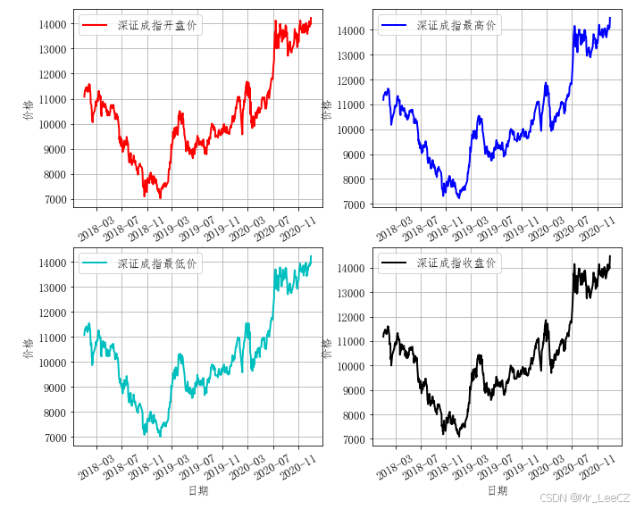
堆叠直方图与并排直方图
SH_SZ_Index = pd.read_excel('data/上证综指和深证成指的日涨跌幅数据(2019-2020年).xlsx',sheet_name='Sheet1',header=0,index_col=0) SH_SZ_Index # 显示行索引的格式 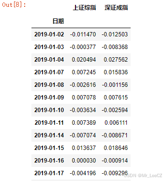
SH_SZ_Index = np.array(SH_SZ_Index) # 将数据框格式转换为数组格式 SH_SZ_Index 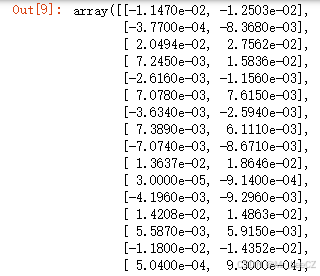
plt.figure(figsize=(9,6)) plt.hist(SH_SZ_Index,label=[u'上证综指日涨跌幅',u'深证成指日涨跌幅'],stacked=True,edgecolor='k',bins=30) plt.xticks(fontsize=13) plt.xlabel(u'日涨跌幅',fontsize=13) plt.yticks(fontsize=13) plt.ylabel(u'频数',fontsize=13) plt.title(u'上证综指和深证成指日涨跌幅堆叠直方图') plt.legend plt.grid() plt.show() 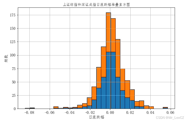
plt.figure(figsize=(9,6)) plt.hist(SH_SZ_Index,label=[u'上证综指日涨跌幅',u'深证成指日涨跌幅'],edgecolor='k',bins=30) plt.xticks(fontsize=13) plt.xlabel(u'日涨跌幅',fontsize=13) plt.yticks(fontsize=13) plt.ylabel(u'频数',fontsize=13) plt.title(u'上证综指和深证成指日涨跌幅并排直方图') plt.legend plt.grid() plt.show() 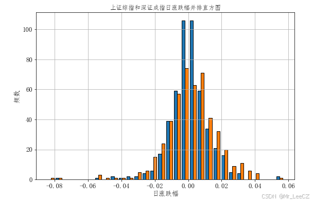
综合条形图与折线图的双轴图
M2 = pd.read_excel('data/我国广义货币供应量M2的数据(2019-2020年).xlsx',sheet_name='Sheet1',header=0,index_col=0) M2 # 显示行索引的格式 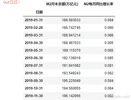
fig, ax1 = plt.subplots(figsize=(9,6)) # 运用左侧纵坐标绘制图形 plt.bar(x=M2.index,height=M2.iloc[:,0],color='y',label=u'M2 每月余额') plt.xticks(fontsize=13,rotation=90) plt.xlabel(u'日期',fontsize=13) plt.yticks(fontsize=13) plt.ylim(0,250) plt.ylabel(u'金额(万亿元)',fontsize=13) plt.legend(loc=2,fontsize=13) ax2 = ax1.twinx() plt.plot(M2.iloc[:,-1],lw=2.5) plt.yticks(fontsize=13) plt.ylim(0,0.13) plt.ylabel(u'增长率',fontsize=13) plt.title(u'广义货币供应量 M2 每月余额和每月同比增长率',fontsize=13) plt.legend(loc=1,fontsize=13) plt.grid() plt.show() 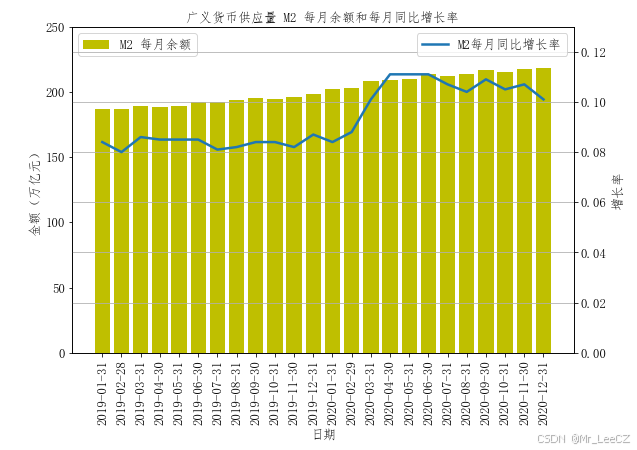
散点图
ICBC_CCB = pd.read_excel('data/工商银行与建设银行A股周涨跌幅数据(2016-2020年).xlsx',sheet_name='Sheet1',header=0,index_col=0) ICBC_CCB.describe() 
ICBC_CCB.corr() 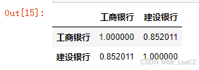
plt.figure(figsize=(9,6)) plt.scatter(x=ICBC_CCB['工商银行'],y=ICBC_CCB['建设银行'],c='r',marker='o') plt.xticks(fontsize=13) plt.xlabel(u'工商银行周涨跌幅',fontsize=13) plt.yticks(fontsize=13) plt.ylabel(u'建设银行周涨跌幅',fontsize=13) plt.title(u'工商银行与建设银行周涨跌幅的散点图',fontsize=13) plt.grid() plt.show() 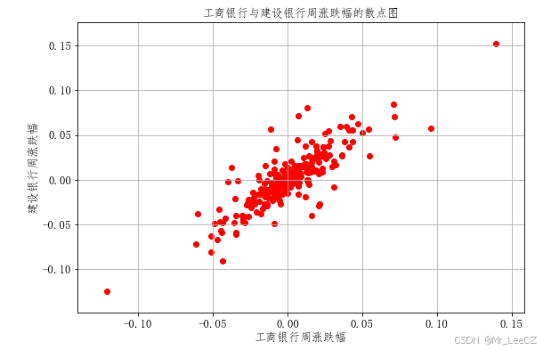
饼图
currency = ['美元','欧元','人民币','日元','英镑'] perc = [0.4173,0.3093,0.1092,0.0833,0.0809] plt.figure(figsize=(9,7)) plt.pie(x=perc,labels=currency,textprops={'fontsize':13}) plt.axis('equal') plt.title(u'特别提款全中不同币种的权重',fontsize=13) plt.legend(loc=2,fontsize=13) plt.show() 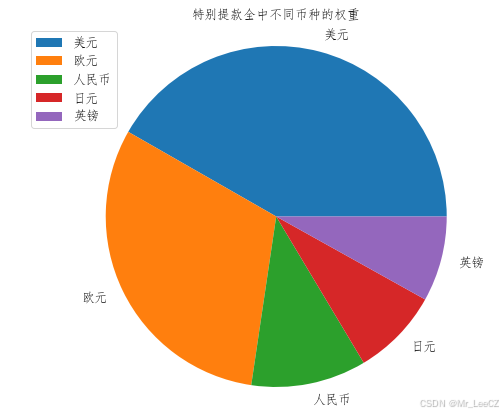
雷达图
company = ['中国人寿','中国人保','中国太保','中国平安','新华保险'] indicator=['营业收入增长率','净利润增长率','净资产收益率','偿付能力充足率'] ranking = np.array([5,4,3,2]) N_company=len(company) N_indicator=len(indicator) ranking_new=np.concatenate([ranking, [ranking[0]]]) # 在中国太保各项指标排名的数组末尾增加一个该数组的首位数字,以实现绘图的闭合 angles = np.linspace(0, 2*np.pi, N_indicator, endpoint=False) angles_new = np.concatenate([angles,[angles[0]]]) plt.figure(figsize=(8,8)) plt.polar(angles_new,ranking_new,'--') plt.thetagrids(angles*180/np.pi,indicator,fontsize=13) plt.ylim(0,5) plt.yticks(range(N_company+1),fontsize=13) plt.fill(angles_new, ranking_new, facecolor='r',alpha=0.3) plt.title(u'中国太保各项指标在 5 家A股上市保险公司中的排名',fontsize=13) plt.show() 
K 线图
import pandas as pd import mplfinance as mpf SH_Index=pd.read_excel('data/2020年第3季度上证综指的日交易数据.xlsx', sheet_name="Sheet1", header=0,index_col=0) SH_Index.index = pd.DatetimeIndex(SH_Index.index) # 数据框的行索引转换为 Datatime 格式 SH_Index.columns # 显示列名 Index([‘开盘价’, ‘最高价’, ‘最低价’, ‘收盘价’, ‘成交额(万亿元)’], dtype=‘object’)
SH_Index=SH_Index.rename(columns={'开盘价':'Open','最高价':'High','最低价':'Low','收盘价':'Close','成交额(万亿元)':'Volume'}) mpf.plot(data=SH_Index,type='candle',mav=5,volume=True,figratio=(9,7),style='classic',ylabel='price',ylabel_lower='Volume(trillion)') 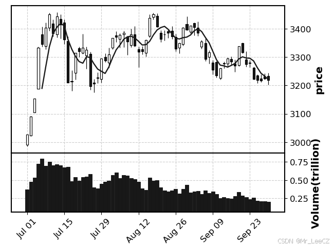
color=mpf.make_marketcolors(up='r',down='g') style_color=mpf.make_mpf_style(marketcolors=color) mpf.plot(data=SH_Index,type='candle',mav=(5,10),volume=True,figratio=(9,6),style=style_color,ylabel='price',ylabel_lower='Volume(trillion)') 
